31 days of Savoring Home: Day 2 Kitchen before!
Posted by Kristen on Oct 2, 2012 in 31 Days of Savoring Home, House and Home | 4 commentsWhen we decided to venture into this foreclosure the drawbacks were the kitchen and the bedroom situation. The kitchen was a traditional gally kitchen with the sink, dishwasher, and oven all on one small wall with very minimal counter space and a door at the end of the “aisle” meaning it was going to be our main little boy traffic zone from the backyard. We originally considered a big renovation, adding another bedroom and bath but decided our money was best spent hiring someone to help us redo the kitchen. And although we are still pining for an extra room we are loving the kitchen and so glad we expanded it!
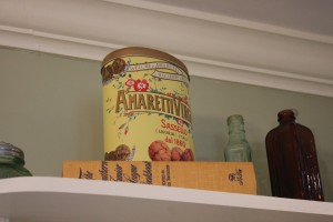
(on a completely unrelated note, it looks like Seth was thinking about escaping to Spain (based on the book above) while he was doing the house inspection…..geesh that was a stressful time. So glad he didn’t leave us and go to Spain)
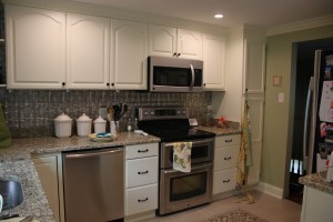
So…….I dreamed and pinned and researched and drew. We eventually decided the best plan would be to remove the door and put in a window in it’s place. We knocked out a wall between the dining room and kitchen to open up the space and added a counter top for serving, homework and junk mail important papers, and just extra space in general. We added the window in the place of the door so that I could see the boys in the backyard while washing dishes and working in the kitchen. And to minimize the traffic zone through the kitchen from the back door. The window is one of my favorite things about the kitchen!
For the backsplash I chose a faux metal tile from Lowe’s. My original plan was the paint it and distress it but in the end I have really liked the mix of finishes and I am holding off on changing it up. For the paint we had to go with the same paint as the living room and dining room because the rooms are all connected. We went with Timothy Hay from the Martha Stewart line at Home Depot. We are really pleased with how it turned out and ties the spaces together.

Martha Stewart- Timothy Hay (it looks much more cheery in person. And it is for sure more accurate in the pictures.)
We utilized the original cabinets and had them repainted to match the drawers and additional cabinets that we added. We updated the hardware with brushed oiled bronze hardware from Home Depot to compliment the faucet (Moen also from Home Depot). We added molding above the cabinets to make the cabinets go up to the ceiling and to match the rest of the rooms.
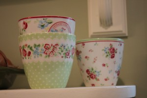
Because of the limited cabinet storage space we also had our contractor build open shelving around the sink. I wanted these shelves to be practical to store things that we use on a regular basis like snacks and fruit but also wanted some pretties. My favorite things on the shelves are the old tins, my special sign made by my friend Jennifer (you will get to hear about her home soon!) and my Green Gate cups…these are mommy only cups! I see lots of Swiss hot chocolate in their future.
None of the appliances worked so we looked around for scratch and dent sales. We decided for resale value to go for the stainless steal which was a huge splurge. I still laugh when I look at our fridge. After our mini fridge in Switzerland it seems comical that we could even manage to even use part of it…but somehow we do. We went with a double oven and I am so glad we did! It comes in handy so often when I am cooking dinner and doing baking projects with the kids. On Saturday we made homemade pizzas with some family and we were able to cook 4 pizzas at once! The oven for me, along with all of the appliances were a pleasant surprise. With all of the decisions to make I left the appliances to Seth. I knew he would stick to our budget and I knew in the end whatever we got would do the job. But what he got exceeded my expectations. I didn’t even review what he ordered I just saw them when I came and they were in. Great job, Seth!
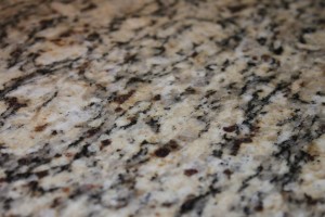
We went with Santa Cecilia granite counter tops. I initially wanted a smaller grain, if that’s what it’s called. So the counter tops didn’t turn out exactly like I wanted but I love that I can set hot things on them, they hide the spots and spills a little better and they are just so durable with kids.
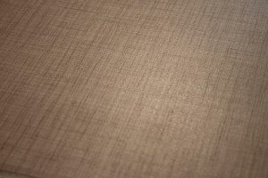
For the floor we chose a tile with a tweed texture look to it. I loved the added texture and wanted to bring out the warmth of the creams and taupe from the counter tops.
So, there you have it! The kitchen. Let me know if I forgot anything!
I mentioned before that the appliances were a pleasant surprise but I really must say that the whole kitchen feels like a big fat gift. Seth has known for a while that I wanted a place of our own and the Foreign Service lifestyle just doesn’t always make that easy. When we bought the house it needed so many repairs and it would have been easy to slap some paint on cabinets and try to make it all work for a while but Seth really let me go with the kitchen and make choices that I really loved. I am sure he thought my mix of aluminum back splash, oiled bronze fixtures, etc were way out there but he just let me enjoy the process….and in the end he liked it all! I spend most of my days in there and I still pinch myself sometimes that it’s ours. Strange I know but true.
Tomorrow you get to tour a bit of my friend Leigh’s humble abode! You are going to love it! At the end of seeing her sweet space you may just want to hop a plane and head down to Texas for some Southern hospitality! Or maybe that’s just what it makes me want to do, but you’ll love the pictures!
PS- this is our 500th post…craziness!! We started in December of 2006 and have now blogged from the US, South America and Europe, through many moves, the addition of 2 babies, ups, downs and in betweens. Thanks for reading!
read more
